Does Having Too Much Information on My Website Put Customers Off?
When you’re proud of your business, it’s natural to want your website to explain everything. You want visitors to know about your services, your experience, your prices, your guarantees and all the reasons they should choose you. Before long, your homepage is packed with information, and every section feels too important to remove.
But have you ever considered whether too much information on your website could be putting potential customers off?
Imagine walking into a shop where every product, offer and instruction is displayed directly in front of you. You might find what you need eventually, but the experience could feel confusing. A business website can create a similar problem when visitors have to work too hard to find the answers they’re looking for.
The solution isn’t necessarily to remove valuable content. It’s to make sure the right information appears in the right place, at the right time, so customers can make decisions without feeling overwhelmed.
Quick Answer
Yes, having too much information on your website can put customers off, particularly when pages are crowded, messages are repetitive or visitors struggle to find what they need. Too many competing details can make it harder for people to understand your services, compare options and decide what to do next.
However, a detailed website isn’t automatically a bad website. Customers often need useful information before making a purchase or requesting a quote. The aim is to organise content clearly, answer important questions early and make additional details easy to find. A well-structured website can be comprehensive without feeling complicated.
Can Too Much Information on Your Website Put Customers Off?
Too much information becomes a problem when it makes a customer’s decision more difficult rather than easier. The issue isn’t simply how many words appear on a page. It’s whether those words are relevant, clearly presented and helpful to someone considering your business.
For example, imagine you run a plumbing company. A customer visits your website because their boiler has stopped working. They want to know whether you cover their area, offer boiler repairs and can be contacted quickly. If your homepage opens with a long company history, detailed descriptions of every plumbing service and several unrelated promotions, the information they need may be difficult to find.
Now consider a customer planning a complete bathroom renovation. They may want detailed information about the process, materials, previous work and likely timescales. A short page containing only a photograph and a contact button might leave them with too many unanswered questions.
The difference is customer intent. Someone dealing with an urgent problem may need a quick answer, while someone planning a larger purchase may need more reassurance before getting in touch.
The Real Problem Is Information Overload
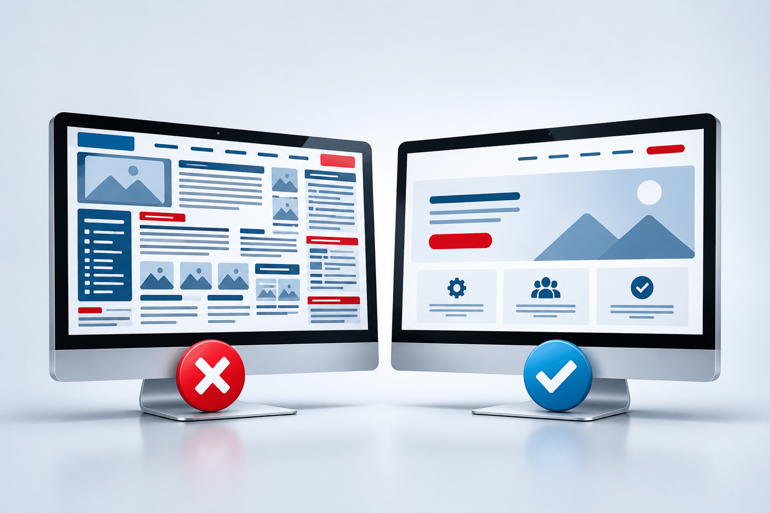
Information overload happens when someone is presented with more information than they can comfortably process for the decision they’re trying to make. On a website, this can happen through lengthy unbroken text, too many choices, confusing navigation or several messages competing for attention.
People shouldn’t have to read every sentence to understand what your business offers. Good headings, sensible page layouts and clear calls to action help visitors pick out the information that matters to them.
Think of your website as a helpful member of staff. It should answer the customer’s immediate question first, then offer more detail when they need it.
Seven Signs Your Website Has Too Much Information
A website can look attractive and still feel difficult to use. The following warning signs are worth checking, especially if visitors regularly ask questions that your website already answers.
1. Your Homepage Tries to Explain Every Service
If your business offers several services, it’s tempting to describe each one in full on the homepage. However, a visitor looking for one particular service may have to scroll through large amounts of unrelated information.
Give each main service a short introduction and link to a dedicated page for further details. This keeps the homepage easier to understand while allowing interested customers to explore the services that matter to them.
2. Visitors Face Too Many Choices at Once
A page filled with buttons asking people to call, email, book, download, subscribe, request a quote and follow your social media accounts can create confusion. When every action appears equally important, visitors may struggle to decide which one to take.
Choose one main action for each important page, then include secondary options where they genuinely help. For example, a cleaning service page might focus on requesting a quote while still making the telephone number easy to find.
3. Your Website Repeats the Same Message
Repeating your strongest selling points can sometimes help, particularly on longer pages. But repeating the same paragraph or making the same promise in several consecutive sections adds length without giving customers anything new.
Review your content and remove unnecessary duplication. If you’ve already explained your experience and reliability, use the next section to answer a different customer question, such as what the service includes.
4. Important Details Are Hidden in Large Blocks of Text
Even useful information can be difficult to absorb when it appears in long paragraphs without headings or spacing. Visitors may miss prices, opening hours, service areas or booking instructions simply because those details are buried.
Break longer explanations into manageable paragraphs and give sections descriptive headings. Use short lists when they make practical information easier to scan, but don’t replace every explanation with bullet points.
5. Your Navigation Menu Is Overcrowded
If your main menu contains a long list of pages, visitors may find it difficult to understand where to go. Similar page names can make the problem worse, especially when customers aren’t familiar with your business terminology.
Group related pages under clear headings and use words your customers recognise. For example, a garage might organise its services under Repairs, Servicing and MOTs rather than listing every individual repair in the main navigation.
6. Too Many Pop-Ups and Promotions Interrupt Visitors
Discount banners, newsletter invitations, chat windows and special-offer messages can all compete with the information a customer originally came to see. When several appear together, the page may feel pushy rather than helpful.
Keep promotional messages relevant and avoid interrupting visitors before they’ve had a chance to understand your offer. A useful message at the right moment is generally more considerate than several competing requests for attention.
7. Customers Keep Asking Questions Your Website Already Answers
If people regularly phone to ask about your service area, opening times or how to request a quote, it may indicate that the information isn’t easy to find. The problem may not be missing content, but poor placement or confusing wording.
Pay attention to the questions customers ask most often. They can reveal which details deserve a more prominent position on your website.
What Information Do Customers Actually Need on a Business Website?
Most customers visit a business website with a particular question or goal. They may want to check whether you offer a service, compare options, understand costs, see evidence of your work or contact you. Your website should help them complete that task without unnecessary effort.
Although different businesses need different content, several types of information are commonly useful.
| Information | Why Customers Need It | Where It Often Belongs |
|---|---|---|
| What your business does | Helps visitors confirm they’ve found the right business | Near the top of the homepage |
| Main services or products | Shows whether you can meet their needs | Homepage overview and individual pages |
| Service areas | Helps local customers check availability | Homepage, service pages and contact page |
| Prices or pricing guidance | Helps customers judge suitability and budget | Relevant service or pricing pages |
| Reviews and examples | Provides evidence and reassurance | Relevant pages and a dedicated gallery or review area |
| Contact and booking options | Allows visitors to take the next step | Clearly visible throughout the website |
| Policies and detailed terms | Explains important conditions and obligations | Dedicated, accessible pages |
The aim isn’t to place every detail on every page. It’s to make sure visitors can find the information relevant to the decision they’re making.
Put Customer Questions Before Company History
Your experience, background and achievements can help build trust. However, customers usually need to understand what you can do for them before they become interested in your full business story.
A local electrician’s homepage, for example, should make electrical services, coverage areas and contact details clear before presenting several paragraphs about how the company was founded. The company history can still have a valuable place on the About Us page.
How Much Information Should Be on Your Homepage?
There is no universal word count or fixed number of sections that makes a homepage successful. The right amount depends on your business, the services you offer and what visitors need to know before taking action.
A small beauty salon may need a relatively simple homepage introducing treatments, opening hours, location and booking options. A company providing specialist commercial equipment may need more explanation because customers have a more complicated buying decision.
A useful homepage structure often includes:
- A clear headline explaining what your business offers.
- A short introduction identifying who you help and where.
- An overview of your main products or services.
- Relevant reasons to trust your business.
- Selected customer reviews or examples of your work.
- A clear way to enquire, book or request a quote.
These are starting points, not a compulsory formula. The important question is whether each section helps visitors understand your business or take the next step.
Should Everything Important Appear at the Top?
No. The top of the page should communicate the most important message quickly, but it doesn’t need to contain every detail. Trying to squeeze services, testimonials, prices, guarantees and contact options into the first screen can make the design crowded.
Prioritise what visitors need to know immediately, then organise the remaining information further down the page. Customers who need more reassurance should be able to find it without interrupting those who are ready to contact you.
How to Organise Website Content Without Losing Important Details
Reducing information overload doesn’t mean deleting half your website. Often, a better approach is to rearrange existing content so visitors can understand the basics first and explore additional details when they’re ready.
Give Important Services Their Own Pages
If you run a cleaning company offering domestic cleaning, office cleaning and end-of-tenancy cleaning, each service may deserve its own page. Customers can then read information that directly relates to their needs instead of searching through one enormous description.
Dedicated service pages also provide room to explain what’s included, answer common questions and describe how to book. Your homepage can introduce each service briefly and direct visitors to the appropriate page.
Use Clear, Descriptive Headings
Headings should help customers understand what comes next. Instead of a vague heading such as “Our Commitment”, a section titled “What’s Included in Our Cleaning Service?” gives visitors a clearer reason to continue reading.
Try reading only the headings on one of your pages. If they don’t give a reasonable overview of the content, consider rewriting them. This is a simple way to check whether someone scanning your website can find the information they need.
Introduce Details Gradually
Some customers want a quick overview, while others need more detail before making a decision. You can support both by introducing the main points first and offering additional information through clearly labelled sections or links.
For example, a kitchen installation company might explain its design process in three simple stages, then link to a more detailed page covering materials, installation timescales and preparation. Customers can choose how much information to explore.
Expandable FAQ sections can also be useful when they work properly on mobile devices and remain accessible. However, don’t hide information that every customer needs, such as important conditions or essential pricing details, simply to make the page look shorter.
Remove Content That Doesn’t Help the Customer
Look for paragraphs that repeat an earlier point, use unnecessary jargon or discuss subjects unrelated to the page’s purpose. Ask whether the information helps a customer understand your service, build confidence or make a decision.
If it doesn’t, consider removing it, shortening it or moving it to a more appropriate page. This approach is usually better than cutting useful explanations simply to meet an arbitrary word limit.
Are Long Website Pages Bad for SEO?
No. Long website pages are not automatically bad for search engine optimisation (SEO). A detailed page can be useful when it answers relevant questions clearly and provides information visitors genuinely need.
Google’s guidance on helpful, people-first content encourages website owners to create useful, reliable material rather than content designed mainly to attract search traffic. Google also warns against writing to a particular word count simply because someone claims search engines prefer it.
This means a 2,000-word guide isn’t necessarily better than a 600-word service page, and a shorter page isn’t automatically easier to rank. The content needs to match the purpose of the page and satisfy the questions visitors bring with them.
Can Removing Content Hurt Your Search Visibility?
It can, particularly if you remove useful information that helps visitors and search engines understand what the page covers. Deleting entire sections without checking their value may leave important questions unanswered or remove content that attracts relevant search visits.
Before making major changes, review the page’s purpose, existing search performance and the information customers actually use. Google Search Console can help you see which searches lead people to your pages, although it doesn’t tell you exactly which paragraphs visitors find useful.
If you need help reviewing how your content supports both customers and search visibility, our Website Copywriting service is one option for improving the clarity and structure of your website’s wording.
Does Clearer Content Help AI Search?
Clear headings, direct explanations and well-organised information can make a website easier for readers and automated systems to understand. However, there is no guarantee that shortening a page or reorganising its content will make it appear in ChatGPT, Google AI Overviews or another AI-powered search service.
The sensible approach is to write useful content for customers first. Explain your services accurately, answer common questions and make important information accessible without unnecessary repetition.
Why Too Much Information Can Be Worse on Mobile Phones
Mobile visitors have less screen space available, so crowded layouts and lengthy sections can feel more demanding. A paragraph that looks manageable on a desktop monitor may occupy most of a phone screen, particularly when the text is large or the layout is narrow.
Customers using a mobile phone may also be trying to complete a quick task, such as finding your telephone number, checking opening times or booking an appointment. They shouldn’t have to scroll past several promotional sections to find a basic answer.
Check your website on an actual mobile phone rather than relying only on a desktop preview. Look for oversized images, awkward spacing, difficult menus, small buttons and information that appears in an unhelpful order.
What Should You Prioritise on Mobile?
Keep the main message clear, use readable text and make important actions easy to reach. A customer should be able to identify your business, understand the service and find the next step without needing to zoom in or search through complicated menus.
Google’s page experience guidance also encourages website owners to consider mobile usability and avoid elements that distract from the main content. This supports a practical goal: make the page comfortable for real people to use.
How to Tell Whether Your Website Is Overwhelming Visitors
You don’t need an expensive research project to begin checking whether your website has too much information. A few practical tests can reveal problems that are easy to overlook when you’re familiar with your own business.
Try the Five-Second Test
Show your homepage to someone unfamiliar with your business for around five seconds, then hide it. Ask them what your business does, who it’s for and what they would do next if they wanted to enquire.
This is a quick informal check, not a scientific measure of website performance. If the person struggles to identify your main service, your opening message may need to be clearer.
Ask Someone to Complete a Real Task
Give a friend or colleague a realistic task, such as finding the price of a service, checking whether you cover a particular town or locating the booking form. Watch where they hesitate or take an unexpected route.
Don’t guide them through the website. Their difficulties may reveal confusing labels, hidden information or too many competing choices.
Review Your Website Data
Website analytics can help you identify pages that attract visitors but produce few enquiries or bookings. You might also examine where visitors leave, which pages they explore and whether contact forms are being completed.
However, don’t assume that a high exit rate or short visit proves your content is too long. Someone may leave after finding exactly what they need, while another visitor may stay longer because they’re confused. Look for patterns and combine the numbers with actual customer feedback.
Make One Meaningful Change at a Time
If you discover a problem, begin with a focused improvement. You might rewrite the opening headline, simplify a service section or make the main contact option more visible. Check whether the change helps before redesigning the entire website.
This makes it easier to understand which improvements are useful rather than changing everything and guessing what worked.
Expert Insight From Daren Ward

Daren Ward – Founder, A to Z Website Solutions
From my experience working with business websites, I would recommend looking at the order of information before deciding that a page contains too many words. A detailed explanation may be valuable, but it becomes less useful when customers have to work through unrelated information to find it.
One practical approach is to review each important page around three questions: What does the visitor need to understand first? What evidence might they need before trusting the business? What action should they be able to take next?
For example, someone visiting a builder’s website may first want to confirm that the company carries out extensions. They might then want to see examples of completed projects and understand how quotations work. A long company history may be useful, but it probably shouldn’t interrupt that journey.
I would normally recommend keeping useful detail available while making the page easier to follow. Sometimes the best improvement isn’t deleting content at all. It’s moving the right information into the right sections so customers can find what matters without unnecessary effort.
Action Checklist: Make Your Website Easier to Understand
- Open your homepage on a mobile phone and check whether your main service is immediately clear.
- Read each page’s headings without reading the paragraphs to see whether they tell a logical story.
- Identify repeated explanations and remove unnecessary duplication.
- Move detailed service descriptions onto dedicated pages where appropriate.
- Make sure your telephone number, enquiry form or booking option is easy to find.
- Reduce competing buttons and promotions on important service pages.
- Check whether prices, service areas and important conditions are easy to locate.
- Ask someone unfamiliar with your business to complete a simple task on your website.
- Review common customer enquiries to identify information that needs clearer placement.
- Check search and enquiry performance before removing large amounts of existing content.
Frequently Asked Questions
1. How much information should a small business website have?
A small business website should contain enough information to explain its services, answer important customer questions and make the next step clear. There is no fixed number of words or pages that suits every business. A straightforward local service may need less explanation than a complicated or expensive purchase.
2. Can too much text make customers leave my website?
Yes, particularly when the text is repetitive, poorly organised or unrelated to what the visitor needs. However, long text isn’t automatically a problem. Useful information presented with clear headings and readable paragraphs can help customers make informed decisions.
3. Is a simple website better than a detailed website?
Neither is automatically better. A simple website can work well for a business with a straightforward offer, while a detailed website may be necessary for services that require more explanation. The best approach is to make information easy to understand and find, regardless of how much content you need.
4. Should I remove information from my homepage?
Remove or relocate information that distracts from your homepage’s main purpose, but keep content that helps customers understand your business. Often, moving detailed explanations to individual service pages is better than deleting them entirely.
5. Do customers prefer short or long website pages?
Preferences depend on what customers are trying to achieve. Someone looking for an emergency repair may prefer a quick answer, while someone planning an expensive home improvement may want more detail. Your page should provide the information needed for that particular decision.
6. Can too many services on one page confuse customers?
Yes, especially when the services are different or need separate explanations. Brief service summaries with links to dedicated pages can make it easier for visitors to find the information relevant to them without removing useful detail.
7. Does Google prefer websites with fewer words?
No. Google does not recommend a universal word count for web pages. Its guidance focuses on helpful, reliable content that meets people’s needs. A shorter page is not automatically better for SEO, and adding unnecessary words does not guarantee improved rankings.
8. How many buttons should I put on a website page?
There is no fixed number. A useful approach is to give each page one clear main action, such as requesting a quote or booking an appointment, while including other options where they help. The problem is usually competing actions rather than the total number of buttons.
9. Should I put all my FAQs on the homepage?
Not usually. A few important questions may fit naturally on the homepage, but detailed answers are often better placed on relevant service pages or a dedicated FAQ page. This allows customers to explore the questions that matter to them.
10. How do I know whether my website needs redesigning?
Start by checking whether visitors can understand your services, navigate the website and contact you easily. If problems are limited to wording or content order, smaller improvements may be enough. A redesign may be worth considering when the layout, navigation and overall structure make the website consistently difficult to use.
Summary: Give Customers the Information They Need, Not Everything at Once
Having too much information on your website can put customers off when it makes pages confusing, difficult to navigate or unnecessarily time-consuming to read. However, the answer isn’t to strip away every detailed explanation. Customers still need enough information to understand your services and feel confident about contacting you.
Focus on what visitors are trying to achieve. Put the most useful information first, organise supporting details clearly and make it easy for people to find the next step. Use separate service pages, descriptive headings and sensible navigation to keep valuable content accessible without overwhelming visitors.
If your website has become crowded or difficult to follow, our Website Redesign service can be an option when the problem extends beyond the wording to the overall layout and structure. You may also find that a few carefully chosen content improvements are all you need.
Key Takeaways
- Too much information becomes a problem when customers struggle to find what matters.
- A detailed website can still be easy to use when content is well organised.
- Your homepage should introduce the business clearly rather than explain everything at once.
- Dedicated service pages can keep important details available without overcrowding other pages.
- Clear headings, readable paragraphs and sensible navigation help visitors find answers.
- Long pages aren’t automatically bad for SEO, and removing useful content can create problems.
- Mobile usability and real customer feedback can reveal where information feels overwhelming.
- The aim is to make decisions easier, not simply to reduce the number of words.
Found This Helpful? Share It
If you found this article useful, please share it with other business owners who might find it helpful too.
A quick share on LinkedIn, Facebook or your favourite social platform could help someone else find the advice they need.