
What Makes a Small Business Website Look Professional?
Imagine someone recommends your business to a potential customer. Before making contact, that person visits your website to see what you offer. Within moments, they’re forming an opinion about whether your business looks reliable, organised and worth contacting.
That first impression isn’t just about attractive colours or a smart-looking logo. Customers also notice whether your website explains your services, works properly on their phone and makes it easy to get in touch. A website can look attractive but still leave people unsure about the business behind it.
So, what makes a small business website look professional, and how can you improve yours without spending a fortune? The answer comes down to getting several important details right and making them work together.
Quick Answer
A professional small business website has a clean, consistent design, easy navigation, readable text, good-quality images and clear information about the business. It works properly on mobile phones, loads without unnecessary delays and makes contacting the business straightforward.
Professionalism also comes from trust. Visitors should be able to understand what you do, where you operate, what makes your business suitable for them and how to take the next step. Genuine reviews, accurate contact details and clear service descriptions can all help. You don’t need an expensive or complicated website. A simple, well-organised website that answers customers’ questions can look far more professional than an elaborate design that is confusing to use.
What Makes a Small Business Website Look Professional?
A professional-looking website gives customers the impression that your business takes its work seriously. It should feel organised, trustworthy and easy to understand. Visitors shouldn’t have to guess what you sell, which services you provide or how to contact you.
The strongest websites combine appearance with usefulness. An attractive design helps create interest, but clear information and smooth navigation help visitors decide whether your business is right for them. Both matter because customers are visiting for a reason, not simply to admire the design.
For example, a local electrician might need only a straightforward website showing services, areas covered, qualifications where relevant, genuine customer reviews and contact details. That could be more effective than an elaborate website filled with animations but missing basic information.
Think of professionalism as a combination of three qualities: clear presentation, useful information and trustworthy business details. If one is missing, the whole website can feel less convincing.
Why Your Website’s First Impression Matters
Customers often visit several businesses before choosing one. Your website may be one of the first places they look when deciding whether to contact you. A confusing or outdated appearance can introduce doubt, even when the business itself provides an excellent service.
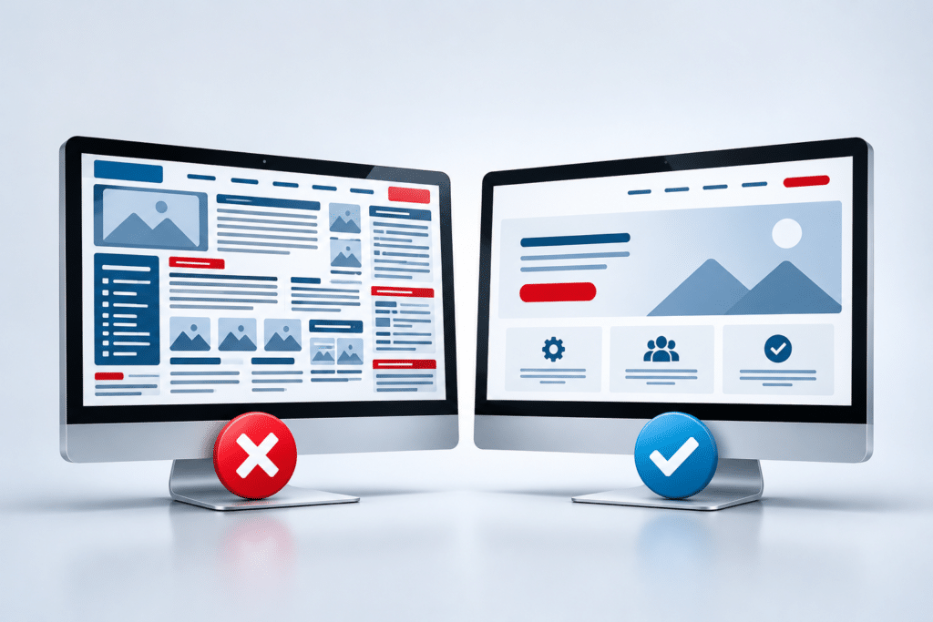
Consider someone searching for a cleaning company. They open two websites. One has clear headings, tidy photographs, service descriptions and an obvious quote button. The other has crowded pages, tiny text and several links that don’t work. The first business is likely to feel easier to deal with, although appearance alone doesn’t prove which company does better cleaning.
That’s an important distinction. A professional website can support confidence, but it shouldn’t be used to hide poor service or make misleading claims. The goal is to give customers an accurate and reassuring picture of your business.
Clean Design, Colours and Branding
Use a Consistent Colour Scheme
Choose a small set of colours that suit your business and use them consistently across the website. Usually, one main colour, one supporting colour and a neutral background are enough. Your headings, buttons and other important elements should follow a clear pattern so the website feels connected rather than assembled from unrelated pieces.
A beauty salon might choose soft colours and spacious layouts, while a garage may prefer a stronger, practical style. Neither approach is automatically better. The right design should suit the customers you want to attract and the type of business you run.
Choose Readable Fonts
Fancy lettering can look attractive in a logo but become difficult to read across an entire website. Use straightforward fonts for service descriptions, prices and contact information. Keep headings noticeably larger than normal text and allow enough space between lines.
Check how your text looks on a smaller mobile screen. If customers have to zoom in to read it, the design needs attention. Readability is more important than choosing the most fashionable font.
Give Your Content Room to Breathe
A professional layout doesn’t try to squeeze everything into the smallest possible space. Clear gaps between headings, paragraphs, images and buttons help people understand which information belongs together. This spacing is sometimes called white space, although the background doesn’t have to be white.
Avoid filling every empty area with badges, icons, moving graphics or promotional messages. A few carefully chosen elements can make a stronger impression than a page competing for attention in every direction.
A Professional Website Must Work on Mobile
A website can look excellent on a large computer screen and still appear unprofessional on a phone. Text may become too small, buttons may sit too close together, images may be cut off or important information may disappear below awkward layouts.
A mobile-friendly website adjusts its content to suit different screen sizes. This is commonly called responsive design. Customers should be able to read, scroll, tap and complete important actions without struggling.
For a local plumber, the phone number and quote request should be easy to find. For a café, customers may want opening hours, the menu and directions. For a beauty salon, appointment booking may be the main priority.
Test your website on a real mobile phone, not just a desktop preview. Check the homepage, main service pages, contact form and any booking or checkout process. A professional website should remain useful when someone is standing outside, travelling or browsing with one hand.
Professional Website Content and Images
Explain What Your Business Does in Plain English
Good website wording sounds like a helpful conversation with a customer. It explains the services you offer, who they’re suitable for and what someone should do next. Avoid vague claims that could describe almost any business.
For example, “We provide outstanding solutions with exceptional quality” tells a customer very little. “We repair and service domestic boilers across Dartford and nearby areas” gives a much clearer picture. Specific information is more useful than impressive-sounding language.
Customers may also want to know your working hours, service areas, pricing approach, appointment process or whether you offer emergency call-outs. You don’t need to answer every possible question on the homepage, but the important details should be easy to find.
Use Genuine, Good-Quality Images
Photographs can make a small business website feel more personal and credible. A builder might show completed work, a hairdresser could display hairstyles with permission, and a café could feature its own food. Real photographs help customers see what the business actually provides.
Stock photographs can still be useful when chosen carefully, but they shouldn’t misrepresent your staff, premises or work. Avoid blurry pictures, stretched logos and images with unrelated subjects. Keep image sizes suitable for the website so large files don’t create unnecessary loading delays.
Check Spelling, Grammar and Accuracy
Small mistakes can make an otherwise attractive website feel neglected. Check business names, service descriptions, opening hours, prices and contact details. Pay special attention to the homepage and the pages customers are most likely to visit.
If writing isn’t your strength, ask someone you trust to review the wording. Clear, accurate information matters more than complicated language. Professional website copywriting can also help when your services are difficult to explain.
Building Trust With Website Visitors
A professional website should give customers enough information to judge whether your business is genuine and suitable for their needs. Trust isn’t created by adding a collection of impressive-looking symbols. It comes from details that customers can understand and, where appropriate, check.
Show Who Is Behind the Business
Introduce the business owner or team when appropriate. Explain what the business does, where it operates and what customers can expect. A friendly About page can be particularly useful for tradespeople, local service providers and businesses where customers invite someone into their home.
Include relevant qualifications, registrations, memberships or insurance information when these genuinely apply. Only display badges and certifications that your business is entitled to use.
Use Genuine Customer Reviews
Customer feedback can help visitors understand what it’s like to deal with your business. Choose genuine reviews and present them accurately. Where suitable, link to an independent review profile so people can explore the feedback themselves.
Don’t invent testimonials or display made-up star ratings. If you’re a newer business without many reviews, focus on explaining your services clearly and showing authentic examples of your work.
Keep Business Information Consistent
Your trading name, phone number, address where appropriate, and opening hours should be accurate. If you operate from home or visit customers at their premises, you can explain your service area without publishing a private residential address.
Customers shouldn’t discover conflicting phone numbers or outdated information on different pages. Consistency makes the business easier to contact and reduces unnecessary confusion.
Speed, Security and Website Quality
Professionalism also depends on how your website behaves. A page that takes too long to load, a broken contact form or a checkout that repeatedly fails can frustrate visitors regardless of how attractive the design looks.
Keep Loading Times Reasonable
Large images, unnecessary animations, poorly configured software and unsuitable hosting can slow a website down. You can check performance using Google’s PageSpeed Insights tool, which provides information about loading performance and areas that may need attention.
Don’t become obsessed with achieving a perfect performance score. Focus on whether your important pages load smoothly and customers can use them comfortably. Some performance improvements may need technical help, while others are as simple as replacing oversized images.
Protect Your Website and Visitors
Use HTTPS so information sent between the visitor’s browser and your website is protected in transit. Keep website software updated, use strong account security and maintain suitable backups. HTTPS is an important security measure, but it doesn’t guarantee that a website or business is trustworthy.
If your website collects personal information, provide appropriate privacy information and handle cookies and tracking in line with applicable requirements. The UK’s Information Commissioner’s Office offers guidance for organisations.
Check That Everything Actually Works
Test contact forms, telephone links, appointment bookings, navigation menus and payment steps where relevant. Check your website after major updates and review it regularly for broken links or missing images.
A smart design won’t compensate for customers being unable to send an enquiry. Working features are part of the professional experience, not an optional extra.
Making It Easy for Customers to Contact You
A professional business website should make the next step obvious. Customers might want to call, request a quote, book an appointment, send an email or buy a product. The most suitable option depends on the business and what the visitor is trying to achieve.
Use clear button wording such as “Request a Quote”, “Book an Appointment” or “Call Us”. Place important contact options where people naturally need them, including relevant service pages. Make sure the buttons lead to the correct destination.
Keep forms reasonably short. A customer requesting a cleaning quote may need to provide their name, contact details, property type and a brief description. Asking for a long list of unnecessary information could discourage them from finishing.
Set realistic expectations about when you’ll respond. If your business normally replies within one working day, explain that rather than suggesting someone is available immediately when they aren’t.
Can a Low-Budget Website Look Professional?
Yes. A small business website can look professional without expensive animations, complicated features or dozens of pages. A modest budget is often best spent on a clean layout, readable content, suitable images, mobile usability and working contact options.
A basic website builder or professionally designed template may be enough for a straightforward business. The important question is whether it allows you to present your services clearly and maintain the website properly. Templates aren’t automatically unprofessional, and custom-built websites aren’t automatically better.
| Website Element | Worth Prioritising | Often Optional |
|---|---|---|
| Design | Consistent colours, readable fonts, clear spacing | Complex animations and unusual effects |
| Content | Clear services, accurate details, helpful explanations | Long promotional statements |
| Images | Relevant, sharp, properly sized photographs | Large decorative image galleries |
| Mobile | Readable pages, usable buttons, working forms | Special effects that only work on desktop |
| Trust | Genuine business details and authentic reviews | Decorative awards or unnecessary badges |
| Contact | Clear calls to action and simple enquiry routes | Complicated enquiry systems |
If you already have a website, you may not need to replace everything. Updating the wording, improving photographs, simplifying navigation and fixing mobile problems can make a noticeable difference. When the design or underlying structure is seriously outdated, a more complete website redesign may be worth considering.
Expert Insight From Daren Ward

From my experience working in website design since 2004, I would encourage small business owners to look at their websites through a customer’s eyes rather than focusing only on how modern the design appears.
Here’s a practical test I recommend. Ask someone who doesn’t know your business to open your homepage on their phone. Give them a short time to work out what you do, whether you cover their area and how they would contact you. Don’t explain anything while they’re looking.
If they struggle, that tells you something useful. You may have spent time choosing colours and images while the information customers actually need is too difficult to find. My preference is always to fix those problems before adding more visual effects. A professional website should make life easier for the customer, not ask them to work harder.
Professional Website Action Checklist
Use this checklist to review your existing website. You can work through most of these checks yourself, even if you have no technical experience.
- Open your homepage on a phone and check that all text is easy to read.
- Ask someone unfamiliar with your business to explain what you offer after viewing the homepage.
- Check that your logo, colours, headings and button styles are consistent.
- Remove blurry, stretched or unrelated images.
- Check that your services and areas covered are clearly explained.
- Make sure your main navigation links lead to the correct pages.
- Test your telephone number, email links and contact forms.
- Review business hours, prices and other information that may have changed.
- Check that any reviews, qualifications and awards displayed are genuine.
- Run an important page through PageSpeed Insights and review obvious problems.
- Check that your website uses HTTPS and that maintenance and backups are arranged.
- Remove unnecessary clutter that distracts from the information customers need.
Start with anything that prevents a customer from understanding your business or getting in touch. Small visual improvements can follow once the main problems are fixed.
Frequently Asked Questions
1. Does a professional website need an expensive design?
No. Professionalism comes from clarity, consistency, usability and trustworthy information rather than the amount spent. A well-chosen template can be suitable for many small businesses. What matters is whether it meets your customers’ needs and works properly.
2. How many pages should a professional small business website have?
There isn’t one correct number. A simple business might need a homepage, service information, an About page and a contact page, plus any required legal information. Businesses with several services, locations or products may benefit from more pages. Each page should have a useful purpose.
3. Should I use stock photographs on my business website?
Stock photographs are acceptable when they’re relevant and don’t mislead visitors. However, genuine photographs of your work, products or team can help customers understand your business more clearly. Never use stock images in a way that falsely suggests they show your actual staff or completed projects.
4. Can I make my existing website look more professional without rebuilding it?
Often, yes. Improving the text, replacing poor images, fixing mobile layouts and simplifying navigation may be enough. If the underlying website is difficult to update, unreliable or unsuitable for your needs, a redesign could be the better long-term option.
5. What colours make a business website look professional?
There is no single best colour scheme. Choose colours that suit your brand and provide enough contrast for easy reading. Consistency matters more than following trends. A small selection of well-used colours usually looks more organised than many competing colours.
6. Do customer reviews make a website look more trustworthy?
Genuine reviews can support trust by showing feedback from people who have used your business. They should be presented accurately and without misleading edits. Reviews are helpful, but they work best alongside clear service information and reliable contact details.
7. Is a mobile-friendly website necessary for a professional appearance?
Yes, mobile usability is a basic expectation for a modern business website. Customers should be able to read your content, use the menu and contact you from a phone without zooming or struggling with small buttons. Test the main customer journey on different screen sizes.
8. Does a professional-looking website automatically rank higher on Google?
No. Attractive design alone doesn’t guarantee better Google rankings. Search visibility also depends on relevant content, technical accessibility, crawlability and other signals. A clear, usable website is a sound foundation, but appearance shouldn’t be confused with search engine optimisation.
9. How often should I update my small business website?
Check important information whenever your business changes and review the website regularly for errors. Service details, opening hours, prices and contact information should stay accurate. Software updates and security maintenance may need attention more frequently, depending on your website system.
10. What is the biggest mistake that makes a business website look unprofessional?
One of the most damaging mistakes is making customers work too hard to understand the business or contact it. Crowded layouts, unclear wording and broken forms can all contribute. Prioritise the customer journey before spending money on decorative features.
Summary: Professionalism Is About More Than Appearance
A professional small business website should look organised, explain your business clearly and work properly for visitors. Clean design, readable text, genuine images and consistent branding help create a positive impression. Useful information, reliable features and honest business details help support that impression.
You don’t have to compete with large companies by building a complicated website. Instead, focus on what your customers need to know and make it easy for them to take the next step. A straightforward website that does these things well can be a valuable asset for a small business.
Your Next Step
Take a fresh look at your website on both desktop and mobile. Start with the changes that would make it clearer, easier to use and more trustworthy. If your current website needs a more substantial improvement, you can explore our website redesign service to see what professional help could involve.
Key Takeaways
- A professional website combines attractive presentation with useful information.
- Clear navigation helps customers find services and contact details quickly.
- Consistent colours, readable fonts and suitable spacing improve presentation.
- Mobile usability is just as important as desktop appearance.
- Genuine photographs, reviews and accurate details help build confidence.
- Working forms, reasonable loading times and security maintenance matter.
- A modest website budget can still produce a professional result.
Found This Helpful? Share It
If you found this article useful, please share it with other business owners who might find it helpful too.
A quick share on LinkedIn, Facebook or your favourite social platform could help someone else find the advice they need.