
Why Your Homepage First Impression Has Just Seconds to Convince Someone to Stay
Someone visits your website. Before they read every word, study your services or learn how long you have been in business, they are already forming an opinion.
Your homepage first impression can influence whether that visitor continues exploring your website or decides to leave. People want to understand quickly where they have landed, what the business offers and whether the website looks trustworthy enough to investigate further.
For a small business, this matters because your homepage may be the first contact a potential customer has with you. A confusing, slow or outdated homepage can make a perfectly good business look less convincing than it really is.
Quick Answer
Your homepage needs to answer a few basic questions quickly: Who are you? What do you offer? Who do you help? Why should someone trust you? What should they do next? Visitors do not normally study a homepage from top to bottom before deciding whether it feels relevant. They scan headings, images, navigation, key messages and obvious calls to action. A clear homepage makes continuing easy. A confusing one gives people another reason to leave.
Why Your Homepage First Impression Matters
Think about how you behave when you visit an unfamiliar website. You probably do not begin by carefully reading every paragraph. You glance at the page and try to work out whether you are in the right place.
Your customers are doing much the same thing. Someone looking for an electrician may want to know whether the business covers their area. Someone looking for an accountant may want to know whether the firm works with small businesses. Someone considering a beauty salon may immediately look for treatments, prices, photographs or a booking option.
If those answers are difficult to find, the visitor has to work harder. That creates friction at exactly the point where you want the website to feel easy.
This is why the first part of a homepage has such an important job. It does not need to tell visitors everything. It needs to give them enough confidence and clarity to continue.
What Do Visitors Look for First on a Homepage?
Different visitors notice different things, but most are trying to answer a similar set of questions. They want to know what the business does, whether it appears relevant to them and whether they feel comfortable taking another step.
People may quickly notice your main heading, photographs, logo, menu, contact details, reviews, location information and buttons. They may also notice problems such as tiny text, poor mobile formatting, slow-loading content or a page covered with competing messages.
You cannot control exactly where every visitor looks. You can control whether the important information is easy to find.
1. Make Your Business Clear Immediately
One of the most common homepage problems is clever wording that does not actually explain the business. A slogan may sound impressive, but if a new visitor cannot work out what you do, it is not doing enough.
Imagine a local cleaning company whose main homepage heading says, “Giving You More Time for What Matters.” That sounds pleasant, but it could describe dozens of different services. A clearer heading might explain that the company provides domestic and commercial cleaning in the local area.
You can still show personality. Clarity should come first.
A useful test is to show the top of your homepage to someone who does not know your business. Give them a few seconds and then ask what they think the company does. If they cannot answer, your message may need improving.
2. Focus on the Customer’s Problem, Not Just Your Business
Your homepage is about your business, but it should make sense from the customer’s point of view. Visitors usually arrive because they need something solved, improved, repaired, purchased or explained.
A plumber’s visitor may have a leaking pipe. An accountant’s visitor may need help with tax or bookkeeping. A landscaper’s visitor may want an unusable garden transformed. The homepage should connect the service with the reason the customer is looking for it.
This does not mean filling the page with sales language. It means explaining services in terms customers understand.
Instead of only saying what you provide, explain what that service helps the customer achieve. Good homepage wording helps people recognise themselves and their problem in the page.
If the wording on your website is difficult to get right, professional website copywriting can help make the message clearer while keeping it natural and specific to the business.
3. Make the Design Feel Trustworthy
People judge the business and the website together. That may not always be fair, but it happens.
An outdated website does not automatically mean an outdated business. A modern website does not automatically mean an excellent business either. However, your visitor has limited information available when they first arrive, so presentation becomes part of the evidence they use to decide whether to continue.
Look for obvious visual problems such as inconsistent colours, difficult-to-read fonts, stretched images, cluttered sections and elements that do not line up correctly. You do not need dozens of visual effects. A clean and organised page often feels more professional than one trying to impress visitors with constant movement.
Your design should support the message rather than compete with it.
4. Check the Mobile Experience
A homepage that looks excellent on a large desktop monitor can feel completely different on a phone. Headings wrap differently, buttons move, images become smaller and navigation may change into a mobile menu.
Do not assume that a responsive website automatically provides a good mobile experience. Open your own homepage on a phone and use it like a customer would.
Can you understand the business without excessive scrolling? Can you read the text comfortably? Are buttons easy to tap? Is the menu easy to use? Can you find the telephone number or contact option without hunting for it?
Also check whether large pop-ups, cookie messages or other elements cover the main content. Something that looks minor on a desktop screen can dominate a small mobile display.
5. Do Not Make Visitors Wait
Website speed affects the experience before the visitor has even had a chance to judge your wording or design. If important homepage content takes too long to appear, some visitors may leave before they properly see it.
Large images, unnecessary scripts, heavy plugins, video and poorly configured hosting can all contribute to performance problems. The exact cause varies from website to website, so simply removing one image or installing another optimisation plugin is not always the answer.
Pay particular attention to the main content visitors see when the page first loads. If the top of the homepage appears in stages, shifts around or remains blank while large files load, investigate why.
Google provides PageSpeed Insights, which can help identify performance and user-experience issues. The report can look technical, but it provides a useful starting point when discussing problems with your website provider.
6. Keep Your Navigation Simple
A homepage does not have to contain every piece of information about your business because its navigation can help visitors reach the detail they need.
Your main menu should use labels that ordinary customers understand. Terms such as Services, About, Contact, Prices or Areas We Cover are usually easier to understand than creative menu names that require interpretation.
If you offer several services, organise them logically. A customer should not need to guess which menu item contains the information they want.
The aim is not to keep every visitor on the homepage. The aim is to help them move through the website without getting lost.
7. Give People Reasons to Trust You
Once visitors understand what you offer, another question appears: “Can I trust this business?”
Useful trust signals vary by business. They might include genuine customer reviews, clear contact information, business experience, professional memberships where relevant, guarantees that genuinely apply, real examples of work or straightforward information about how your service works.
Local businesses can also benefit from making their service area clear. Someone looking for a builder in Dartford, for example, wants to know whether that builder actually works in Dartford before spending time reading the rest of the website.
Avoid filling the homepage with unsupported claims such as “the best”, “number one” or “leading” unless you have genuine evidence to support them. Specific information usually feels more believable than broad claims.
8. Make the Next Step Obvious
A visitor can like your website and still leave without contacting you if the next step is unclear.
Decide what you would ideally like a suitable visitor to do. That could be requesting a quote, calling the business, booking an appointment, viewing services, making a purchase or completing an enquiry form.
Your call to action should describe that step clearly. “Request a Quote”, “Book an Appointment” or “View Our Services” tells the visitor what happens next. A vague button such as “Discover More” may not provide the same clarity.
You can repeat an important call to action at sensible points further down the homepage. Visitors who are not ready to act at the top may be ready after learning more about the business.
9. Do Not Overload the Top of Your Homepage
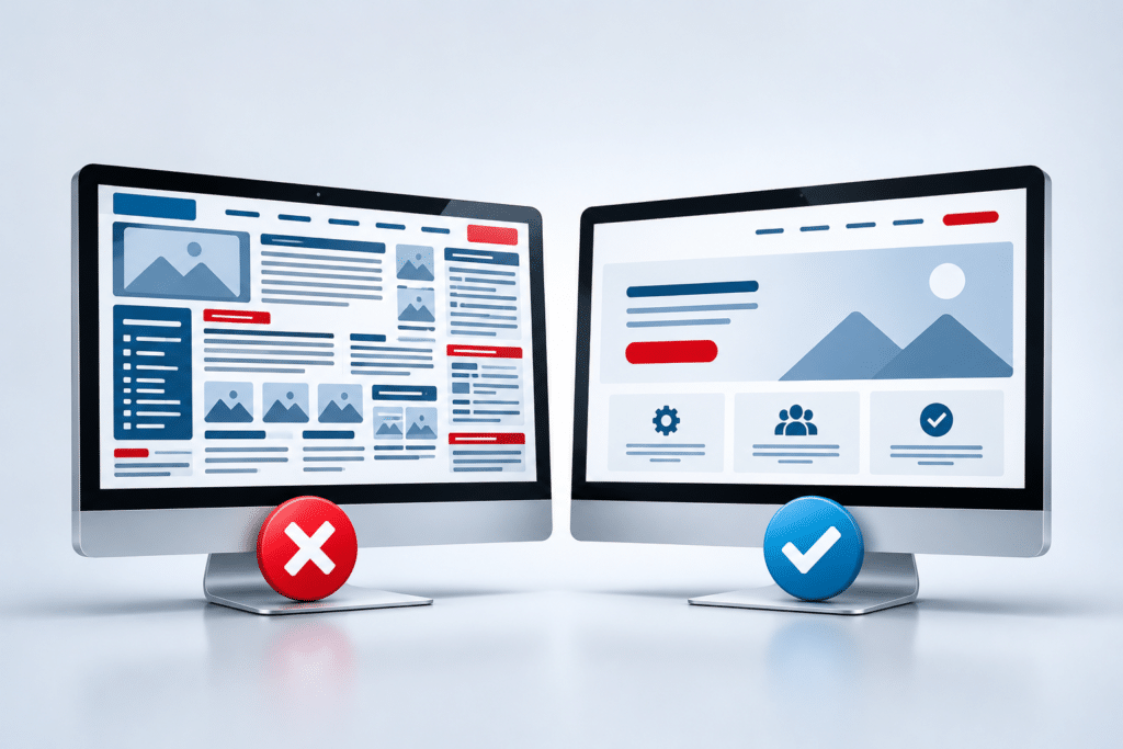
Trying to communicate everything immediately can create the opposite problem. A visitor may see several headings, multiple buttons, promotional banners, moving sliders, pop-ups and competing messages all fighting for attention.
The first screen does not need to explain your entire business. Its main job is to establish relevance and encourage the visitor to continue.
Decide what deserves priority. Usually that means a clear heading, a short supporting message, an appropriate visual and one main action. Secondary information can appear naturally as the visitor moves down the page.
If your homepage has grown over several years, it may be worth reviewing whether every section still deserves its place. Websites often become cluttered because new content is continually added without older content being reconsidered.
Expert Insight From Daren Ward

Daren Ward
Founder, A to Z Website Solutions
Having worked with business websites since 2004, one thing I’ve noticed is that business owners can become too familiar with their own website. They already know what the company does, so the homepage makes perfect sense to them.
A new visitor does not have that background knowledge. They are arriving cold. They need the website to explain the business quickly and guide them towards the information they need.
I would normally recommend looking at your homepage as if you had never seen the business before. Ignore what you know and concentrate on what the page actually tells you. Can you identify the service? Is the location clear where it matters? Is there a reason to trust the business? Can you see what to do next?
A homepage does not need to explain everything in the first few seconds. It does need to give someone a good enough reason to spend the next few seconds finding out more.
Homepage Action Checklist
- Open your homepage without automatically scrolling and check whether it clearly says what your business does.
- Ask someone unfamiliar with your business to look at the homepage briefly and tell you what they think you offer.
- Check the homepage on a real mobile phone, not just the desktop version.
- Make sure your most important heading is easy to understand without industry jargon.
- Check that your main call-to-action button clearly describes what happens next.
- Look for old, blurry, stretched or irrelevant images that weaken the appearance of the page.
- Check whether important trust information is easy to find.
- Remove competing messages that distract from the main purpose of the homepage.
- Test your homepage loading performance and investigate obvious delays.
- Review your menu and check that a new customer could easily find your main services and contact information.
Frequently Asked Questions
How quickly do people judge a homepage?
People can form an initial visual impression very quickly, but there is no single number that applies to every visitor or website. The practical lesson is that your homepage should communicate its purpose clearly without expecting people to study the page before understanding the business.
What should visitors see first on a small business homepage?
Visitors should quickly be able to identify what the business does and whether it is relevant to them. A clear main heading, short supporting message and obvious next step are usually more useful than trying to display every service at once.
Should my homepage show all my services?
Your homepage can introduce your main services, but it does not need to explain every service in full. Individual service pages can provide the detail. The homepage should help visitors identify the right option and move easily to the relevant page.
How much text should a homepage have?
There is no perfect word count for a homepage. It needs enough information to explain the business, answer important customer questions, build trust and guide visitors towards the next step. The right amount depends on the business and what customers need before making contact or buying.
Should my phone number be visible on the homepage?
If telephone enquiries are important to your business, making the number easy to find can reduce unnecessary friction. On mobile devices, a clickable telephone number can make contacting the business particularly straightforward.
Does an old-looking website make customers leave?
An older design does not automatically make someone leave, but poor presentation can influence how professional and trustworthy the business appears. If the website looks neglected, difficult to use or broken on modern devices, visitors may be less willing to continue.
Should I put prices on my homepage?
It depends on your business. Clear prices can be helpful when services are straightforward, while businesses providing tailored quotes may need to explain how pricing works instead. If price is one of the first questions customers usually ask, hiding all pricing information may create unnecessary uncertainty.
Is my homepage more important than my other website pages?
Your homepage is important, but it is not always the first page someone visits. Search engines, social media, advertising and links can take visitors directly to service pages, blog posts or landing pages. The same principles of clarity, trust and easy navigation should therefore apply across the website.
How often should I review my homepage?
Review it whenever your services, prices, locations, contact details or business priorities change. It is also sensible to check it periodically on different devices and look for outdated information, broken links, old images and sections that no longer serve a useful purpose.
When should I consider redesigning my homepage?
A redesign may be worth considering if the homepage looks dated, performs poorly on mobile devices, is difficult to navigate, no longer represents the business or makes important information hard to find. Sometimes smaller changes are enough, so identify the actual problems before deciding that the whole website needs replacing.
Summary
Your homepage does not need to convince every visitor to become a customer immediately. It needs to convince the right visitors that they have arrived somewhere relevant, trustworthy and worth exploring.
Start with clarity. Make it obvious what you do, who you help and what visitors should do next. Then look at the supporting experience: design, mobile usability, speed, navigation, trust signals and the amount of information competing for attention.
Small improvements can make a noticeable difference to how easy your website feels to use. If the wider website is outdated or no longer represents your business properly, a professional website redesign may be worth considering rather than continuing to add more content to a structure that is no longer working well.
A to Z Website Solutions has provided website design and online marketing services since 2004. If your homepage no longer gives the right first impression, you can explore our website redesign service and see whether updating the site could be the right next step for your business.
Key Takeaways
- Your homepage first impression can influence whether someone continues exploring your website.
- Visitors should quickly understand what your business does and whether it is relevant to them.
- Clear wording is normally more useful than clever but vague marketing slogans.
- Your mobile homepage deserves as much attention as the desktop version.
- Slow loading, confusing navigation and clutter can create reasons for visitors to leave.
- Trust signals should be genuine, specific and easy to find.
- Your main call to action should make the next step obvious.
- The top of the homepage should encourage people to continue, not try to explain the entire business at once.