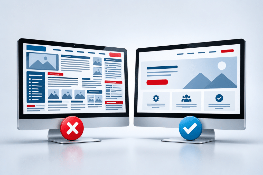

Why a Good-Looking Website Can Still Be Bad for Business
A smart colour scheme, professional photographs and modern design can create a great first impression. But a good-looking website can still be bad for business if it doesn’t help visitors understand what you offer or encourage them to take the next step.
Your website has a job to do. For most small businesses, that job might be generating enquiries, telephone calls, quote requests, bookings or sales. Looking professional matters, but appearance is only one part of what makes a business website effective.
A beautiful website that confuses customers, loads slowly or hides important information can actually make it harder for people to do business with you.
Quick Answer
A good-looking website bad for business problem occurs when appearance has been given more attention than usability, content and business goals. A website can look impressive while still having confusing navigation, weak calls to action, slow pages, poor mobile usability, unclear wording or no obvious reason for a customer to choose the business.
A successful business website needs to combine professional design with clear information, trust, speed, usability and an obvious next step. The real test isn’t simply, “Does my website look good?” It is, “Does my website make it easy for the right customer to do business with me?”
Good Design Is Not the Same as Good Business Performance
Website design and website performance are connected, but they aren’t the same thing. Visual design deals with how a website looks and feels. Business performance is about whether the website helps achieve the reason it exists.
Imagine an accountant’s website with beautiful photography, stylish animation and a fashionable colour scheme. A visitor lands on the homepage because they need help with their accounts. After looking around for 30 seconds, they still can’t work out which accounting services are offered, whether the accountant works with businesses like theirs or how to arrange a conversation.
The website may win compliments for its appearance, but it has made a simple customer journey unnecessarily difficult.
The opposite can happen too. A website doesn’t need to win a design award to generate business. A relatively simple website with clear services, useful information, genuine trust signals and obvious contact options can be much more useful to potential customers.
1. A Good-Looking Website Can Be Bad for Business When the Message Is Unclear
One of the first things a visitor should understand is what your business does. They should also be able to work out whether you can help with the particular problem that brought them to your website.
Some websites sacrifice clarity for cleverness. Large images, short slogans and creative wording might look impressive, but they can leave visitors guessing. Phrases such as “Creating Better Possibilities” or “Building Tomorrow Together” could apply to hundreds of different businesses.
A plumber would normally be better served by making plumbing services, areas covered and contact options immediately clear. A beauty salon should make its treatments and booking route easy to find. An accountant should explain the types of clients and accounting services they support.
Your website shouldn’t make potential customers solve a puzzle before they discover what you sell.
2. It Appeals to You Rather Than Your Customers
Business owners naturally have personal preferences about colours, photographs, layouts and styles. The problem starts when personal taste becomes more important than the needs of the people who will actually use the website.
A website isn’t primarily being built for the business owner. It is being built for customers and potential customers.
Think about why someone arrives at your site. A homeowner looking for an electrician may want to know which electrical work you undertake, whether you cover their area, whether your business appears trustworthy and how quickly they can contact you. They probably aren’t visiting to admire an unusual animation on the homepage.
This doesn’t mean appearance is unimportant. Professional presentation can support credibility. It simply needs to work alongside the customer’s needs rather than getting in their way.
3. The Calls to Action Are Weak or Hidden
Once somebody is interested, what should they do next?
A surprising number of attractive websites don’t make the answer obvious. The telephone number may be difficult to find. The contact button may blend into the design. A quote form might be hidden several pages deep. Visitors may reach the bottom of a service page and find no obvious next step at all.
A call to action tells people what they can do next. Depending on the business, that might be:
- Request a quote
- Call the business
- Book an appointment
- Send an enquiry
- Check availability
- Buy a product
- Arrange a consultation
Good calls to action shouldn’t turn a website into an aggressive sales page. They should simply remove uncertainty. When a potential customer is ready to act, don’t make them hunt for the way to do it.
4. Visitors Have to Work Too Hard to Find Information
Creative navigation can look clever while making a website harder to use. Unusual menu labels, hidden navigation and complicated page structures can leave visitors wondering where information has been placed.
Most small business customers don’t have a reason to learn how your website works. If they can’t quickly find what they need, returning to Google and trying another business is easy.
Keep important navigation labels clear. Terms such as Services, About, Contact, Prices, Areas We Cover and FAQs might not sound exciting, but visitors understand them.
The structure should also reflect the questions customers are likely to ask. If a cleaning company offers domestic cleaning, office cleaning and end-of-tenancy cleaning, separate service information can make it easier for each visitor to reach the content that matters to them.
5. It Looks Better on a Computer Than a Phone
A website can look fantastic on the large screen used to design it and feel completely different on a mobile phone.
Buttons can become difficult to tap. Text can be too small. Forms can be awkward to complete. Large images can dominate the screen, and important information can end up far down the page.
Google uses the mobile version of a site’s content for indexing and ranking through mobile-first indexing, so mobile usability isn’t simply a visual consideration. Google’s mobile-first indexing guidance recommends making sure the mobile version contains the same primary content as the desktop version.
Test the website as a customer would. Don’t only shrink your browser window. Open it on real phones and try completing important tasks, such as finding a service, calling the business and sending an enquiry.
6. Impressive Design Has Made the Website Slow
Large images, video backgrounds, animations and other visual effects can make a website feel impressive. They can also add weight and complexity if they aren’t handled carefully.
Speed matters because customers don’t visit your website to wait for your design to appear. They visit because they want information or want to complete an action.
Google’s Core Web Vitals are measurements designed to assess important aspects of a page’s user experience, including loading performance, responsiveness and visual stability. Google’s Core Web Vitals guidance also explains that good page experience involves more than these measurements alone.
You don’t have to remove every photograph or design feature. The better approach is to ask whether each feature adds enough value to justify its effect on the page.
7. It Looks Stylish but Doesn’t Build Enough Trust
Looking professional can help create trust, but appearance by itself isn’t proof that a business is trustworthy.
A potential customer may also want practical reasons to feel comfortable contacting you. Depending on the type of business, useful trust information could include genuine customer reviews, clear contact information, an About page, relevant accreditations, guarantees that genuinely apply, examples of work, business details and clear explanations of what happens next.
Consider a homeowner choosing a builder. A beautiful homepage may create a strong first impression, but the customer may still want to see the type of work completed, areas covered and information about the business before requesting a quote.
Good website design should make trust information easier to notice, rather than trying to replace it.
8. Nobody Can Find the Website
The most attractive website in your area has limited value if potential customers rarely discover it.
Search engine optimisation isn’t simply about adding keywords to pages. Search engines need to be able to crawl and understand the website, while the content needs to provide useful information that matches what people are searching for.
For a small local business, that can mean having useful individual service pages, clear information about locations served, sensible page titles, descriptive headings, internal links and content that answers real customer questions.
A beautifully minimal website can sometimes create a content problem. Removing useful words simply because a page looks cleaner with less text can leave customers with unanswered questions and give search engines less information about the page.
Google’s guidance on creating helpful, reliable, people-first content encourages website owners to focus on content made primarily to benefit people rather than content created mainly to manipulate search rankings.
If your website looks professional but struggles to attract relevant search visitors, our SEO and AI Visibility service is one option for investigating the wider visibility of the site.
9. The Website Was Designed Without a Clear Business Goal
One of the biggest problems can begin before the first page is designed. Nobody clearly decides what the website is supposed to achieve.
“We need a modern website” is a design requirement, not a business goal.
A better starting point might be, “We want more homeowners to request plumbing quotes,” “We want customers to book beauty treatments online,” or “We want local businesses to enquire about our accounting services.”
Once the goal is clear, design decisions become easier. You can think about which information customers need before taking that action, which pages support their decision and where calls to action should appear.
This is also why copying the design of another website can be a mistake. Two businesses that look similar on the surface may have different customers, services and priorities.
How Should You Judge Whether Your Website Is Working?
Don’t judge the website only by whether you like looking at it. Look at what customers can actually do with it.
Start with a few basic questions. Can a new visitor quickly understand what the business offers? Can they find the service they need? Can they use the site comfortably on a mobile phone? Is there enough information to build confidence? Is the next step obvious?
Website analytics can add another layer of information. Depending on your setup, you may be able to examine which pages people visit, how visitors move around the website and whether important actions are being completed.
Enquiry quality matters too. Ten irrelevant enquiries aren’t necessarily better than five enquiries from people who genuinely need your service. The website should help the right people understand what you offer and decide whether your business fits their needs.
It can also be useful to ask somebody unfamiliar with the website to complete a simple task. For example, ask them to find a particular service and work out how to request a quote. Watch where they hesitate. A problem that has become invisible to you may be immediately obvious to a first-time visitor.
Expert Insight From Daren Ward

Daren Ward – Founder, A to Z Website Solutions
Having worked with business websites since 2004, one thing I’ve learned is that it’s very easy to judge a website by the wrong thing. Business owners naturally notice colours, photographs and layouts because those are the things they can see immediately.
When I look at a business website, I’m also thinking about the customer journey. What does a new visitor see first? Do they understand the service? Can they find the information they need? Is there enough trust? What happens when they’re ready to make contact?
A website can look dated and need redesigning, but simply making it prettier doesn’t automatically solve the business problem. I would normally look at the design, wording, structure, mobile experience and calls to action together. The aim should be to make the website look professional while also making it easier for potential customers to use.
Action Checklist
Use this checklist to look beyond your website’s appearance:
- Check your homepage message: Can a first-time visitor understand what you offer within a few seconds?
- Check your services: Can visitors easily find clear information about each important service?
- Check your next step: Is it obvious how someone can call, enquire, book or request a quote?
- Check your mobile website: Test important pages and forms on a real smartphone.
- Check loading performance: Look for oversized images, unnecessary effects and other elements that may be slowing pages down.
- Check trust: Give potential customers enough genuine information to feel confident about contacting you.
- Check your navigation: Make sure menu labels make sense to an ordinary customer.
- Check your content: Don’t remove useful information purely to create a minimalist appearance.
- Check visibility: Consider whether the website has pages and content that reflect what potential customers actually search for.
- Check results: Look beyond compliments about the design and consider enquiries, calls, bookings, sales and other meaningful actions.
Frequently Asked Questions
Can a beautiful website really hurt my business?
Yes, if the visual design makes the website harder to understand or use. For example, hidden navigation, unclear wording, slow effects or difficult contact options can create unnecessary barriers between an interested visitor and your business.
Does website design still matter?
Yes. Professional design can support credibility, make information easier to understand and create a better first impression. The problem isn’t good design. The problem is treating appearance as the only measure of whether a website is good.
What is more important, website design or content?
They work best together. Design helps organise and present the information, while the content explains what your business offers and answers customer questions. Strong content with poor presentation can be difficult to use, while beautiful presentation with weak content can leave visitors uninformed.
How do I know if my website is confusing customers?
Ask people unfamiliar with the site to complete common customer tasks without giving them instructions. You can also review analytics, enquiry patterns and customer feedback. Pay particular attention to places where people struggle to find services, contact information or the next step.
Should every page have a call to action?
Important commercial pages should normally give visitors a sensible next step, although the action doesn’t need to be aggressive. A service page might invite someone to request a quote, call for advice or read related information depending on the purpose of that page.
Can too many animations make a website worse?
Yes. Animation can be useful when it supports the experience, but too much movement can distract visitors and may add unnecessary complexity or affect performance. Each effect should have a purpose rather than being included simply because it looks impressive.
Does a simple website convert better than a fancy website?
Not automatically. Simple and elaborate websites can both work well. What matters is whether the design suits the business, makes information easy to understand and helps visitors complete the actions the website is intended to support.
Why am I getting website visitors but few enquiries?
There can be many reasons, including attracting the wrong visitors, unclear services, weak calls to action, poor trust signals, confusing pages, pricing concerns or technical problems with contact forms. The best approach is to examine the whole customer journey rather than assuming the visual design is the problem.
Should I redesign a website that already looks good?
Not simply for the sake of changing it. If the site looks professional but isn’t supporting your business properly, first identify what isn’t working. Sometimes improvements to content, navigation, calls to action or individual pages may be enough. In other cases, a wider redesign may make more sense.
What should a business website be designed around?
A business website should be designed around the needs of its intended customers and the goals of the business. Visual identity matters, but it should support clear communication, trust, usability and the actions you want suitable customers to take.
Summary
A website can be visually impressive and still fail as a business tool. Attractive colours, modern layouts and professional images don’t compensate for unclear wording, difficult navigation, weak calls to action, poor mobile usability or slow pages.
Start judging your website from the customer’s point of view. Can people understand what you offer? Can they find what they need? Do they have reasons to trust you? Can they easily take the next step?
The strongest small business websites don’t force you to choose between appearance and performance. Good design should support the customer journey and help make doing business with you easier.
Would You Like Help Improving Your Website?
If your website looks good but isn’t doing enough for your business, a complete replacement isn’t always the first answer. It makes sense to identify where customers may be getting stuck and what needs improving.
If the design, structure and customer journey need wider changes, you can find out more about our website redesign service. A to Z Website Solutions has been providing website design and online marketing services since 2004.
Key Takeaways
- A beautiful website isn’t automatically an effective business website.
- Customers should quickly understand what your business offers.
- Design should support customers rather than make them work harder.
- Clear calls to action make the next step easier to understand.
- Mobile usability and website speed matter as much as desktop appearance.
- Professional appearance should be supported by genuine trust information.
- A website needs useful content if customers and search engines are going to understand it.
- The best measure of a website is how well it supports customers and your business goals, not simply how attractive it looks.